Mixed Resolution Monitor Setup: Best Scaling Solutions Compared
By Elena Petrovic • 30th Jan
Working with a mixed resolution monitor setup has become increasingly common in professional workflows, yet multi-resolution display compatibility remains a persistent challenge for color-critical work. As pixel densities vary across screens, the human visual system navigates discontinuities that can subtly compromise precision work, whether in grading suites or design studios. In this analytical comparison, I'll evaluate the most effective scaling approaches that maintain visual integrity across disparate panels, while addressing fixes for pixel density mismatch essential to professional workflows.
Understanding the Technical Landscape of Mixed Resolution Setups
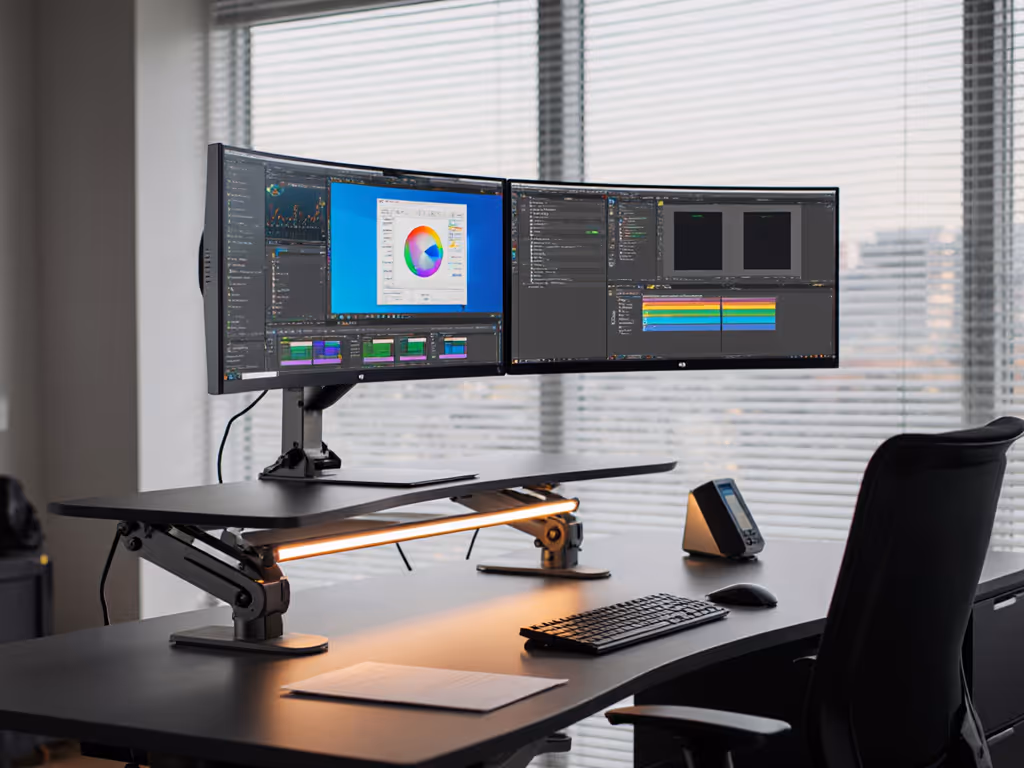
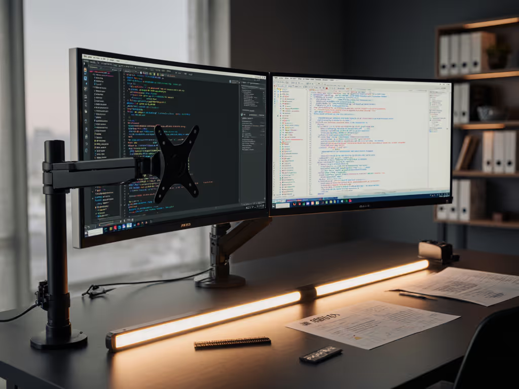
When establishing a multi-resolution display compatibility environment, the fundamental challenge lies in the relationship between physical screen size, native resolution, and pixel density (PPI). A 27-inch 4K display (163 PPI) paired with a 27-inch 1440p screen (109 PPI) creates a 50% pixel density difference that operating systems must reconcile through scaling algorithms. This discrepancy manifests as abrupt visual shifts when moving windows between displays (a particular concern for mixed aspect ratio workflows where precision matters).
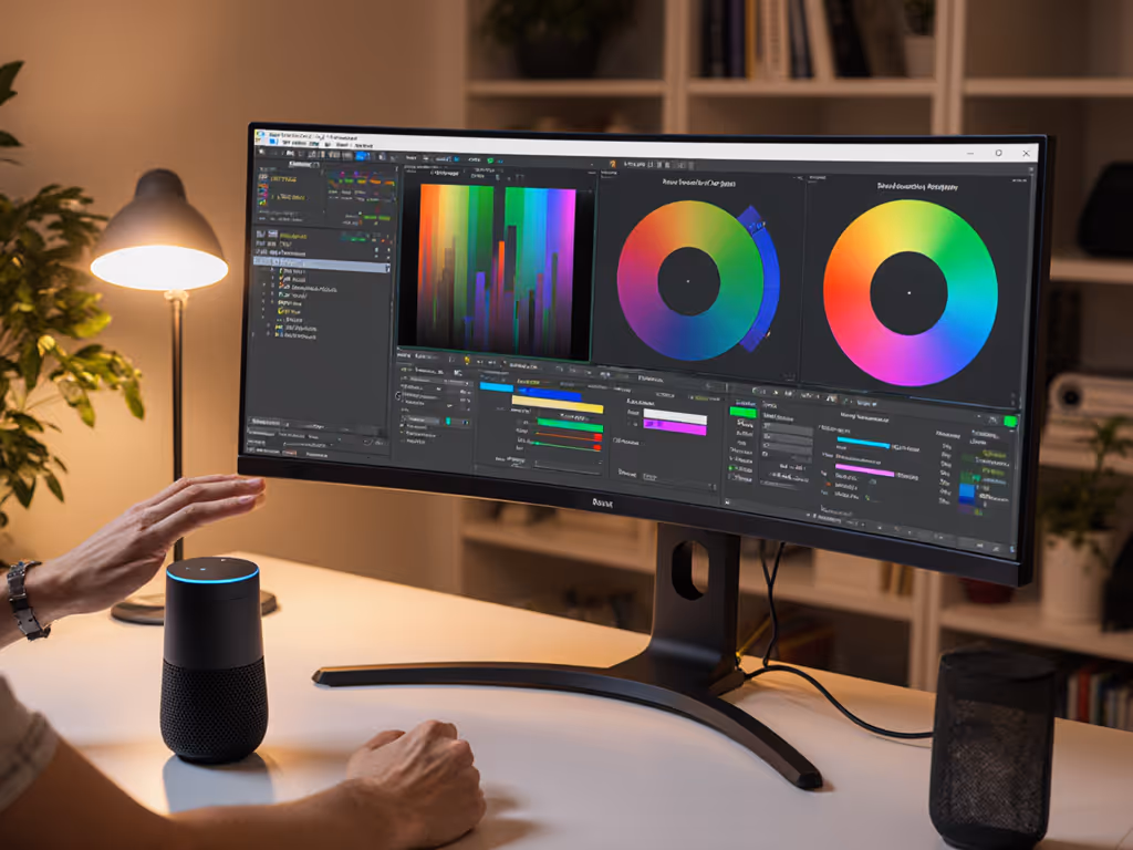
The human visual system perceives this discontinuity not just as a size difference, but as a subtle shift in acuity that affects color judgment. When pixel density varies significantly, the eye's accommodation changes as gaze moves between screens, creating micro-shifts in how we perceive shadow detail and color transitions. This phenomenon explains why many colorists report difficulty matching blacks across mixed-resolution grading suites (a problem that extends beyond simple calibration). These effects add up over long sessions.
Core Challenges in Mixed Resolution Environments
Visual Discontinuity and Perception Shifts
When cursor movement crosses between displays with different scaling factors, the visual discontinuity disrupts workflow continuity. In my experience designing grading environments, even a 10% mismatch in perceived element size can trigger subtle cognitive friction that accumulates over hours of work. This becomes especially problematic in mixed aspect ratio workflows where timeline panels might span both displays.
Color accuracy includes the mount, the cables, and the light. This principle extends to resolution transitions.
Color and Luminance Inconsistencies
Resolution differences often correlate with panel technology variations. A professional 4K OLED reference monitor paired with a standard 1080p IPS productivity display creates dual challenges: differing native gamuts and luminance response curves. When scaling algorithms process content differently across displays, the resulting color shifts may fall below conscious detection yet still impact perceptual consistency.
Application-Specific Scaling Issues
Many applications (particularly those not optimized for mixed DPI environments) display elements inconsistently across scaled displays. Video editors might see timeline rulers with different spacing, while photographers experience inconsistent brush size visualization as they move between editing panels. These discontinuities violate the professional requirement for perceptual uniformity across the workspace. For cross-platform setups, our multi-OS color and workflow guide explains how to keep profiles, scaling, and ergonomics consistent between macOS, Windows, and Linux.
Scaling Solution Comparison: Technical Approaches Evaluated
Native Operating System Scaling
All major operating systems offer system-level scaling controls that adjust UI element size based on display characteristics. On Windows, this appears as "scale and layout" settings, while macOS implements it through "display scaling" options in System Preferences.
Pros:
- Seamless integration with OS interfaces
- No additional hardware required
- Consistent application behavior for properly optimized software
Cons:
- Applications without high-DPI awareness render inconsistently
- Creates "virtual" resolution differences affecting precise pixel work
- May introduce blurring on lower-resolution displays
When implementing OS-level scaling, I recommend setting the primary color-critical display to 100% scaling (no scaling) and scaling the secondary display to match the perceived element size. This approach minimizes processing on the reference monitor while maintaining visual continuity. It also reduces guesswork when moving windows between screens.
GPU-Level Scaling
Modern graphics drivers (NVIDIA Control Panel, AMD Adrenalin, Intel Graphics Command Center) offer display-specific scaling options that operate at the hardware level before output.
Pros:
- More consistent application rendering
- Can implement sharpness controls to minimize blur
- Less system resource overhead than OS-level scaling
Cons:
- Limited fine-tuning compared to OS options
- May conflict with OS scaling settings
- Not all applications respect GPU-level scaling
For color-critical work, I've found that NVIDIA's "No Scaling" option with manual resolution adjustments provides the cleanest image path when managing multi-resolution display compatibility, though it requires careful manual configuration to achieve proper sizing.
Hardware Scaling Solutions
Dedicated hardware scalers and advanced docking stations increasingly offer display management features that can help harmonize mixed-resolution environments. These devices sit between the source and display, applying scaling algorithms before the signal reaches the monitor. If you're driving multiple high-resolution displays through a single cable, see our Thunderbolt 5 docks guide for bandwidth and multi-display compatibility tips.
Pros:
- Consistent behavior across all source systems
- Preserves native signal path to color-critical displays
- Some offer per-port scaling profiles
Cons:
- Additional cost and complexity
- Potential signal degradation
- Limited fine control over scaling algorithms
For studio environments requiring monitor resolution harmonization, hardware scalers provide the most stable solution by establishing fixed scaling parameters that do not rely on operating system variables.
Implementation Best Practices for Professional Workflows
Calibrate Relative to Viewing Environment
I establish a reference by calibrating the primary color-critical display to BT.1886 or PQ curves as appropriate using monitor calibration tools, then adjusting secondary displays to match perceptual luminance response. This requires measuring both displays under identical ambient lighting conditions (a critical environmental caveat many overlook when creating mixed resolution monitor setups). My standard protocol involves:
- Measuring both displays with the same colorimeter
- Creating a relative calibration profile for secondary displays
- Validating through grayscale and color ramp tests
- Confirming with printed reference materials where applicable
Optimize Mounting and Viewing Geometry
Physical placement significantly affects how resolution differences manifest visually. My studio guidelines specify:
- Positioning displays at identical heights with the primary monitor directly in front
- Angling secondary displays to maintain a consistent viewing distance
- Ensuring both displays sit within the same lighting environment (no direct light differentials)
- Matching cable lengths to minimize timing discrepancies
I recall a session where micro-sway in a mounting arm created subtle reflection differences that affected perceived black levels, a reminder that even mechanical stability influences how we interpret resolution transitions. If your arm drifts or vibrates, follow our monitor arm tension guide to eliminate micro-sway at the source. Small physical changes can compound visual inconsistencies.
Standardize Panel Technologies Where Possible
While perfect matching isn't always feasible, I recommend selecting displays with similar panel technologies when building a mixed resolution monitor setup. Pairing two IPS panels (even at different resolutions) creates fewer perceptual discontinuities than mixing IPS and VA technologies. When working with color-critical mixed aspect ratio workflows, this panel consistency matters more than resolution parity for maintaining perceptual uniformity.
Environmental Considerations for Consistent Perception
The ambient viewing environment plays a critical role in how resolution differences manifest. In controlled lighting conditions (50-80 lux for color work), the human eye's ability to detect discontinuities increases significantly. This means that monitor resolution harmonization must account not just for pixel density, but also for how ambient light interacts with each display's surface treatment and brightness capabilities.
I implement a standard 2:1 brightness ratio between primary and secondary displays when working with multi-resolution display compatibility. This creates consistent perceived luminance despite resolution differences (a technique verified through multiple measurement sessions with spectroradiometers). When ambient lighting exceeds 100 lux, I increase the ratio to 2.5:1 to maintain perceptual consistency. Adding neutral bias lighting behind displays can stabilize perceived contrast and reduce eye strain in mixed-resolution workstations. Recheck these values after any lighting change.
Conclusion: Achieving Perceptual Uniformity
Creating an effective mixed resolution monitor setup requires more than technical configuration, it demands a holistic approach that considers the entire perception chain from GPU output to human visual processing. The most successful monitor resolution harmonization strategies treat all elements of the display environment as part of the imaging pipeline.
For color-critical professionals, I recommend starting with hardware-level scaling solutions that minimize processing on the primary reference display, then implementing environmental controls to maintain perceptual consistency. Document your specific configuration parameters, as this enables precise replication across workstations (a critical consideration for collaborative color workflows).
For those seeking deeper technical understanding of how scaling algorithms affect color fidelity, I recommend exploring the latest SMPTE standards on multi-display environments (ST 2086-4:2023) and IEEE papers on perceptual scaling metrics. Understanding these underlying principles will help you make informed decisions when configuring your multi-resolution display compatibility solution.
Whether you're building a dual-monitor editing suite or a multi-display grading environment, remember that true visual consistency emerges from the careful integration of all system components, with hardware, software, and environment working in concert to deliver perceptual uniformity across your entire workspace.
Related Articles